Agency

Ecover is a pioneering eco-friendly cleaning and personal care brand with a strong sustainability ethos and established creative direction. I worked as the UI/UX designer on the redesign and launch of their new global e-commerce website.
While the core brand identity and visual direction were already in place, my role was to translate that vision into a fully realised, responsive digital product. I was responsible for refining the UI, evolving the design system, improving key user journeys, and ensuring accessibility standards were embedded throughout the experience.
The project required a balance of creative sensitivity and systematic thinking — adapting conceptual designs into a scalable, modular e-commerce platform that could support Ecover long term.
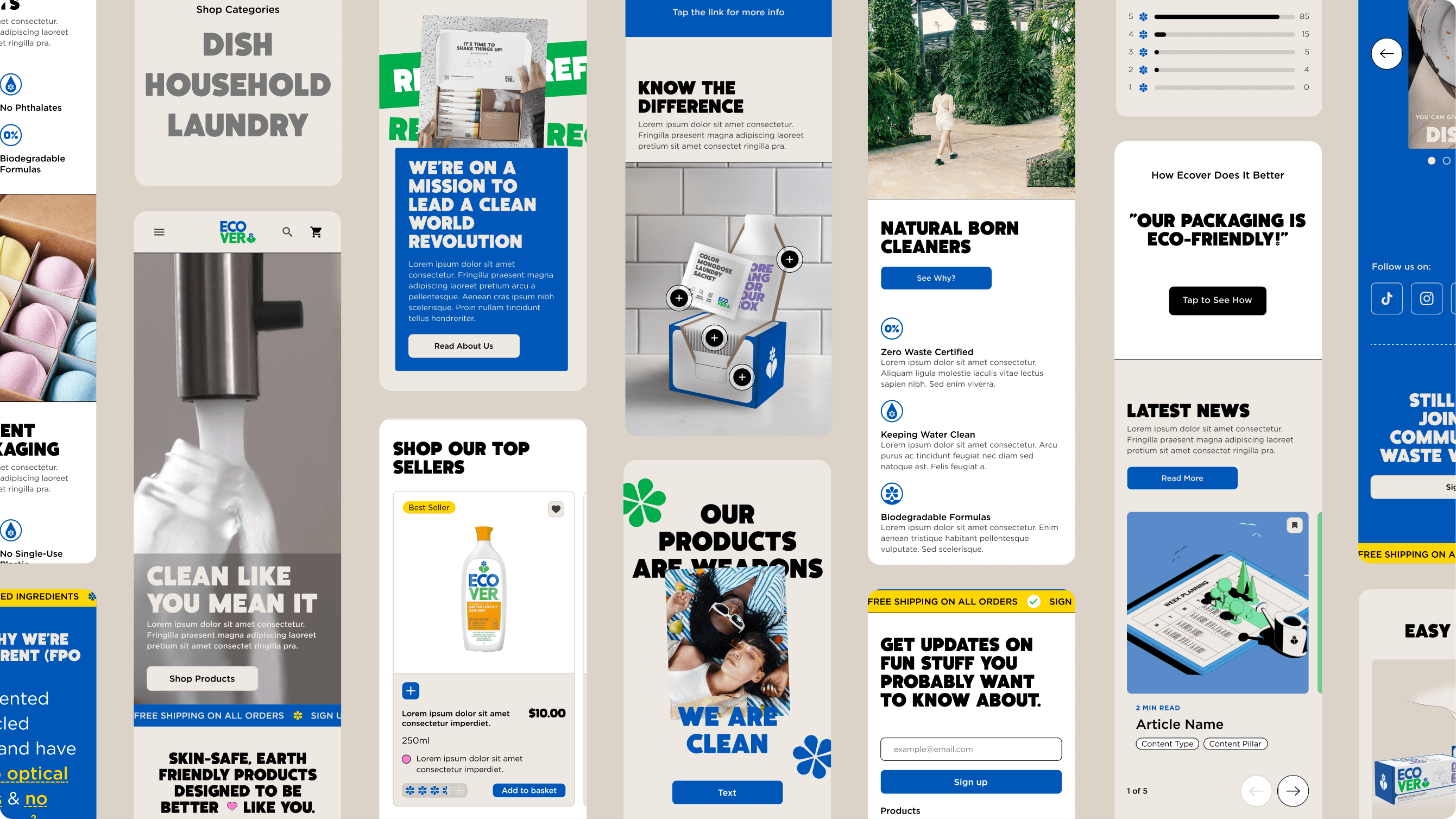
Much of the early UI work began in a conceptual state, with a creative direction already defined. From there, I took ownership of translating that vision into a fully realised, responsive digital product. This wasn’t simply a refinement exercise — it involved designing, restructuring and building out large parts of the interface so it could function coherently across devices and real user scenarios.
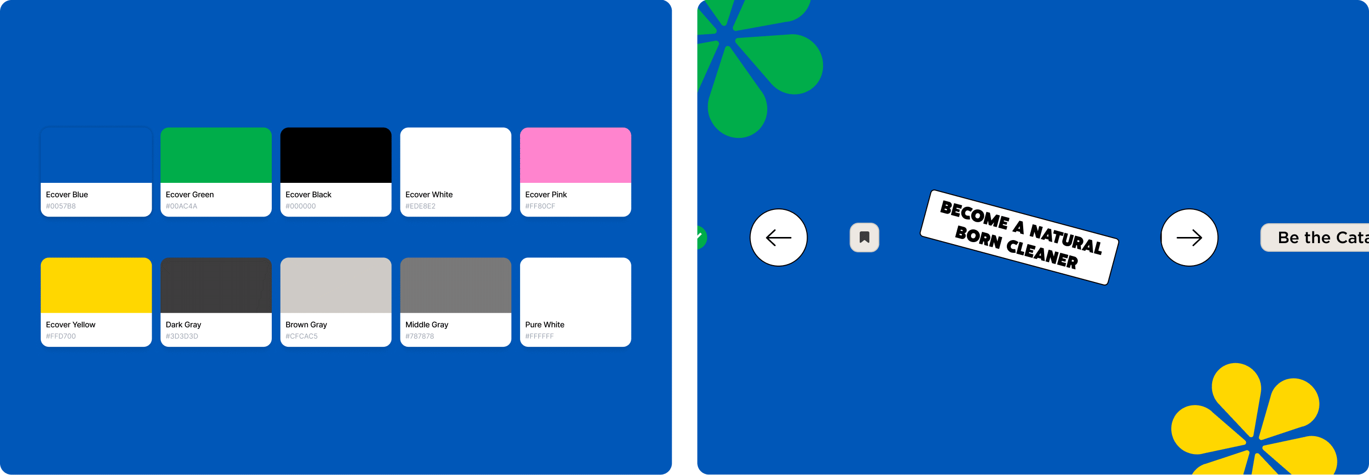
I established the layout systems, defined hierarchy, and designed new components, interaction patterns and subtle microinteractions that enhanced usability and feedback throughout the interface. I also reworked elements where accessibility or usability required improvement. As user journeys evolved and priorities shifted, I adapted and redesigned sections of the experience to better support conversion and clarity.
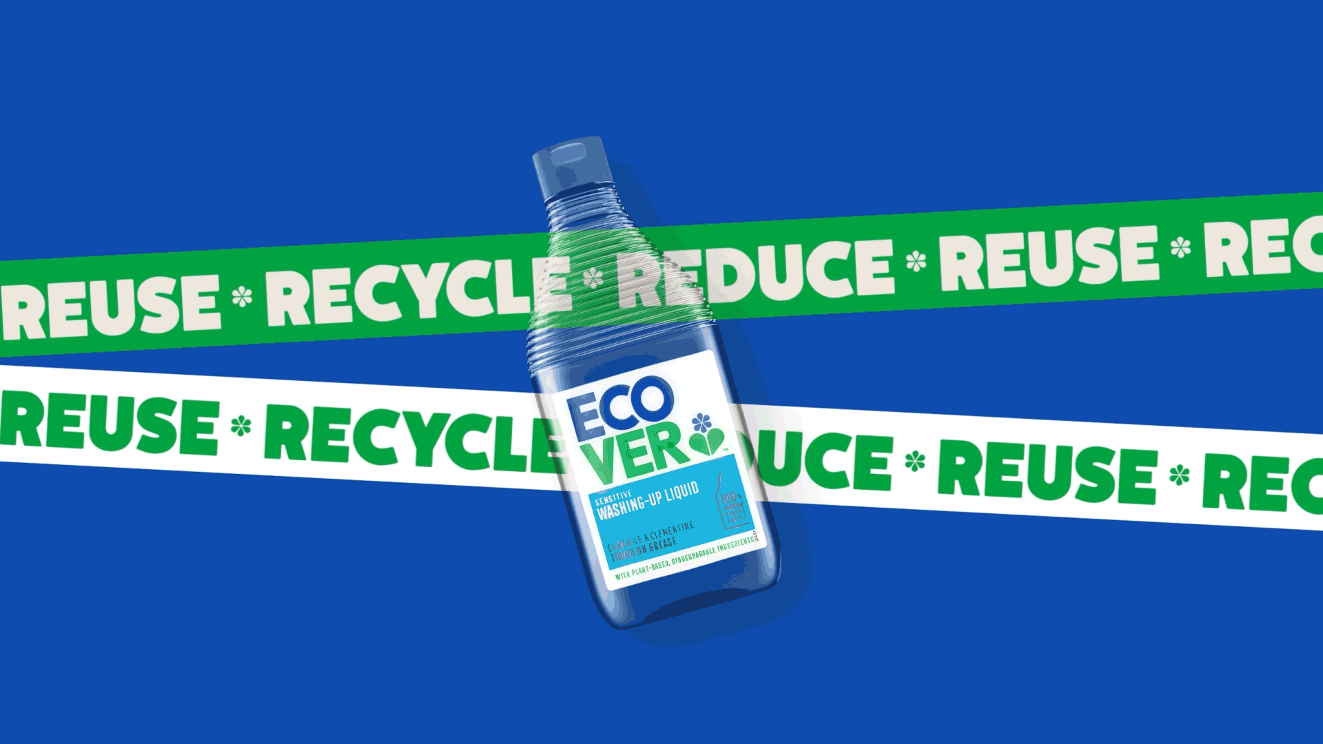
The result is a cohesive and considered digital expression of the Ecover brand — one that retains its visual integrity while operating with the structure, scalability and performance expected of a modern e-commerce platform.
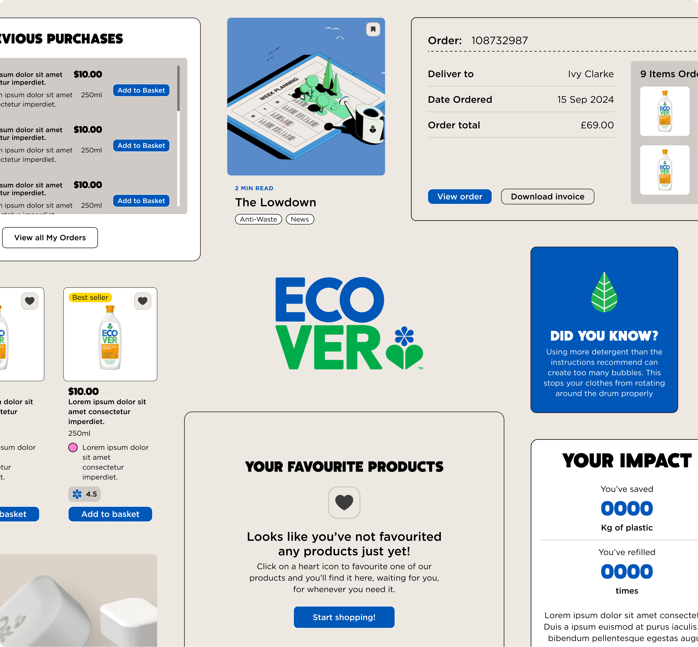
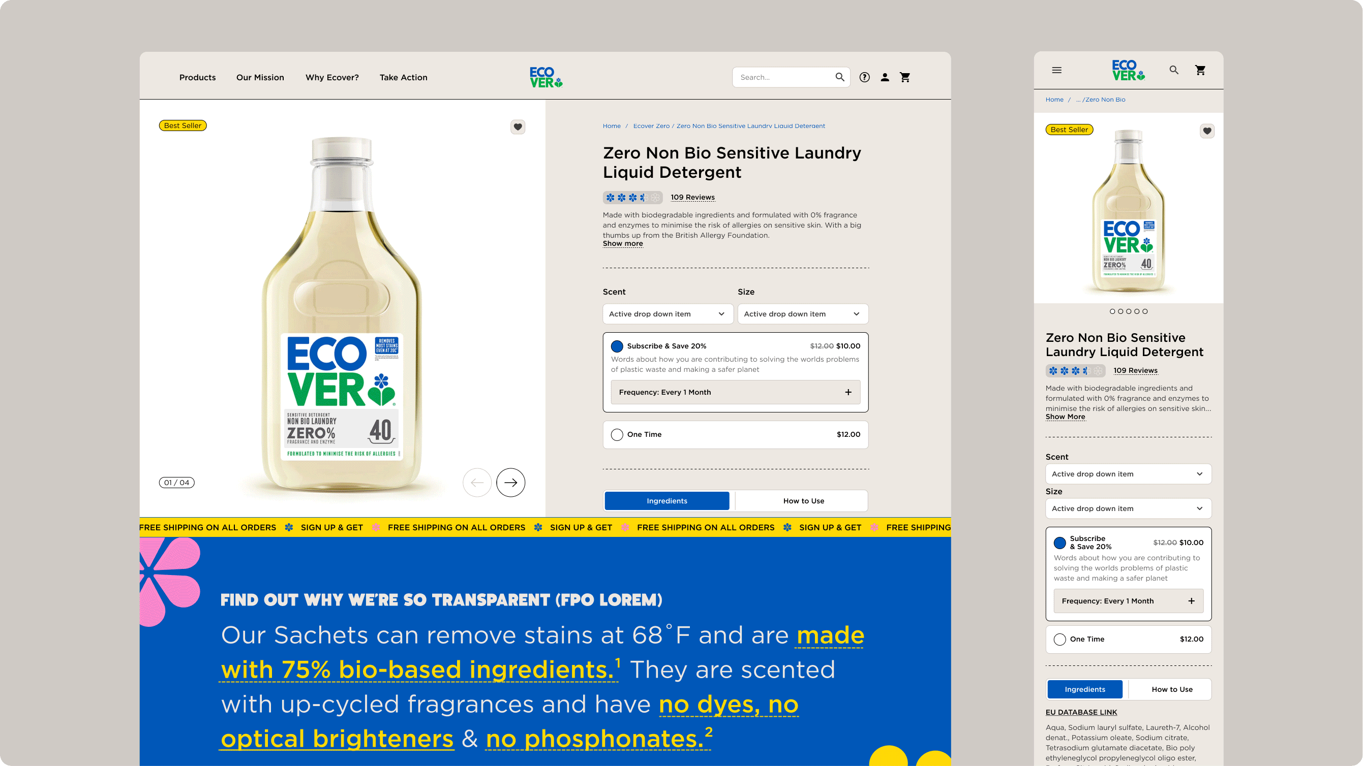
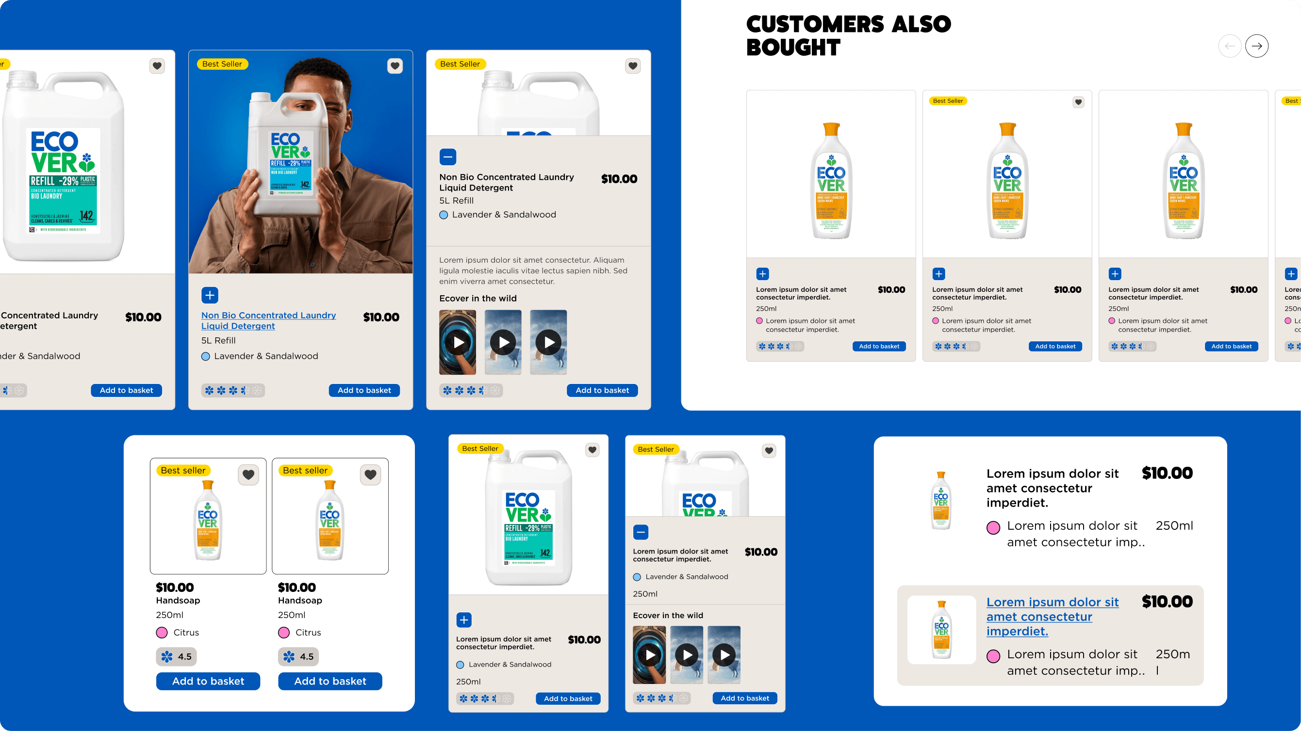
A significant focus of my work was the development of universal Product UI Cards and robust Product Detail Pages. These components had to remain informative and highly functional, while supporting Ecover’s sustainability messaging without overwhelming the user.
I designed a flexible product card system that could adapt seamlessly across listing pages, promotional modules and search results. The Product Detail Pages were carefully structured to guide users from discovery to purchase, balancing ingredient transparency, environmental credentials and conversion-focused call-to-actions.
Search functionality was another key area of refinement. I worked on predictive search states, quick search overlays and structured results pages, ensuring users could navigate the product catalogue efficiently and intuitively.
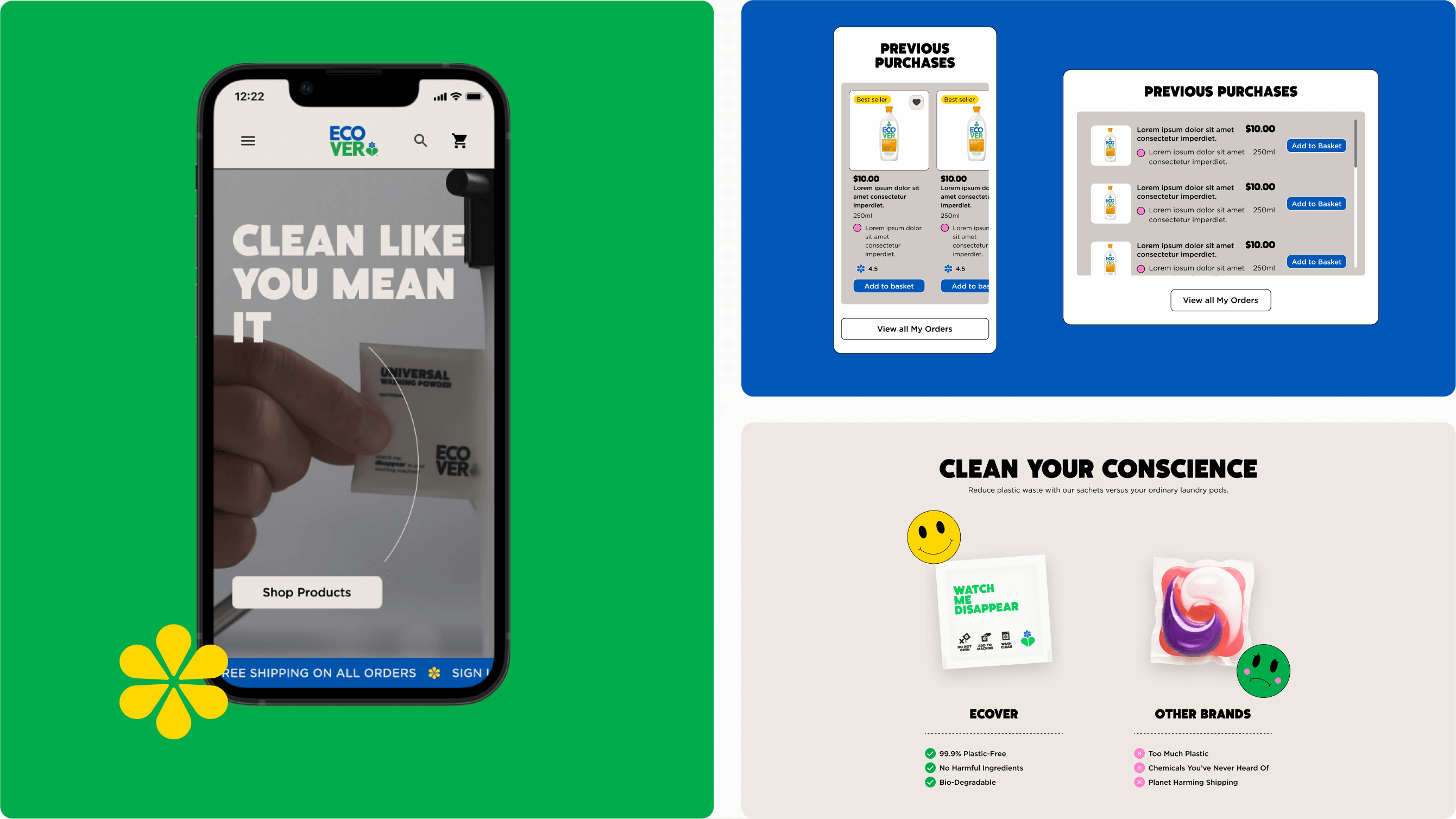
Beyond UI components, I focused on improving complex user journeys, including checkout flows and loyalty sign-ups. I produced wireframes and interactive prototypes to test these journeys across Desktop and Mobile, validating interaction patterns before development.
As the project progressed, a modular design system began to take shape. I refined reusable components and flexible page templates that allow the internal team to evolve the website without compromising consistency. Accessibility was integrated throughout — from contrast and focus states to semantic structure and responsive behaviour.
To support a smooth build process, I created detailed technical annotations for templates, components and interaction states. This documentation ensured clarity during developer handover and established a structured foundation for future design contributions.
Jack Bevan © 2026